Cortado is a branding concept for a coffee shop in Spain that was inspired by my visit to Spain in 2023.
This project features branding, illustrations, and design concepts for email communications.
This project features branding, illustrations, and design concepts for email communications.
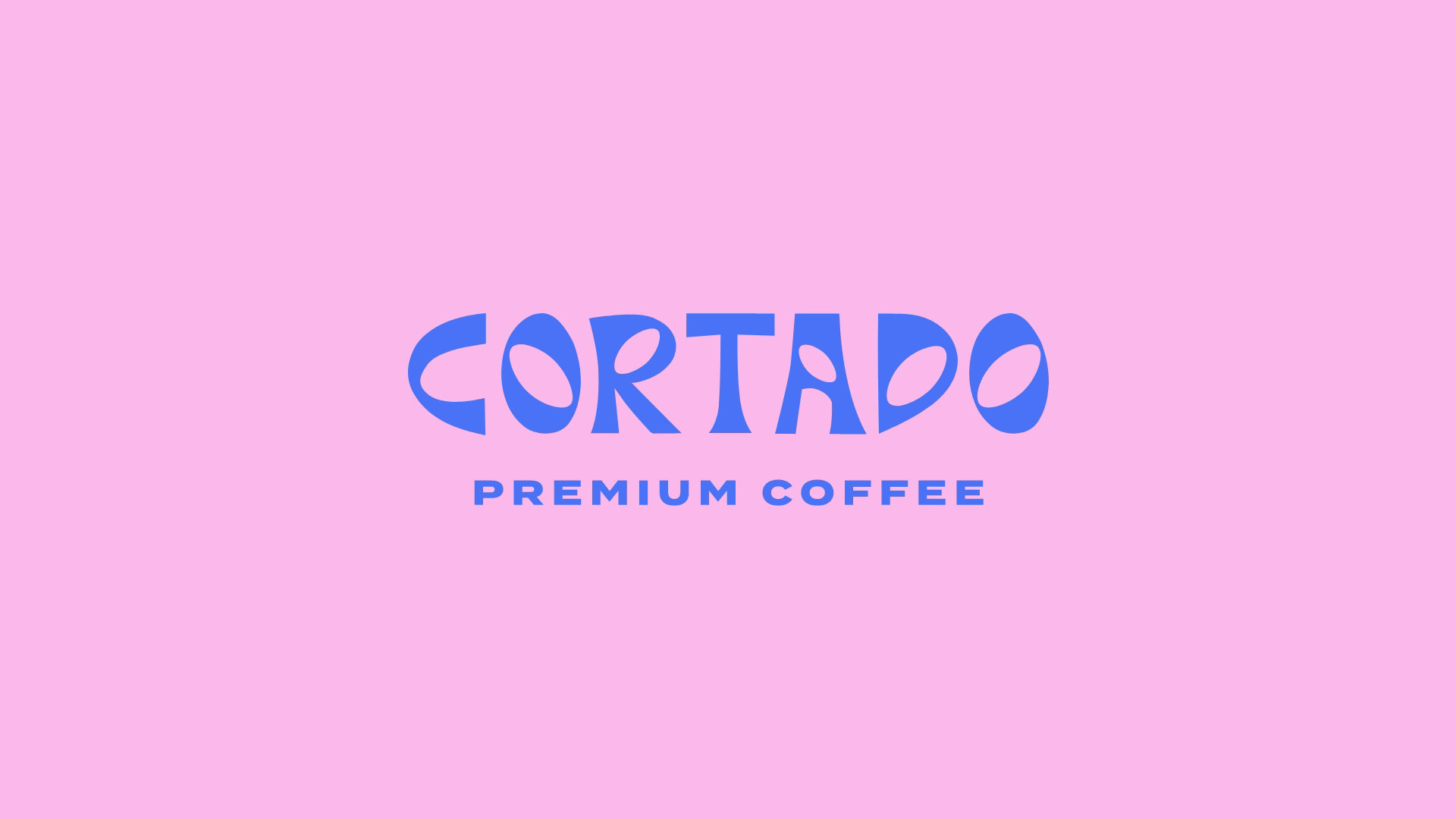
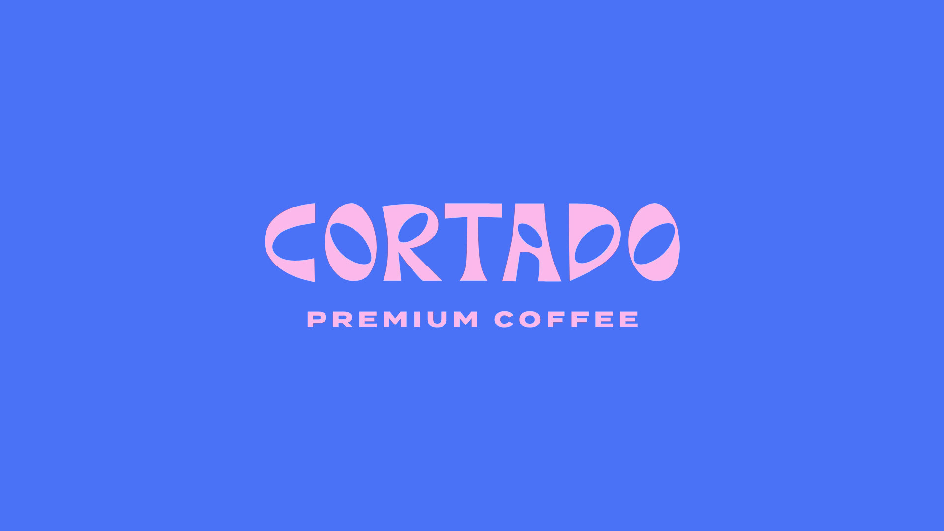
The Cortado logotype is tied to Casa Batlló's stellar architecture. I drew a lot of inspiration from the organic shapes of the building. The negative space in the logo's letters is a reference to the iconic oval-shaped windows of the building. Casa Batllo is known to locals as "Casa dels ossos (House of Bones)," a reference to the natural forms that resemble skeletal shapes. The curvature of the Cortado logotype is a nod to these organic shapes.
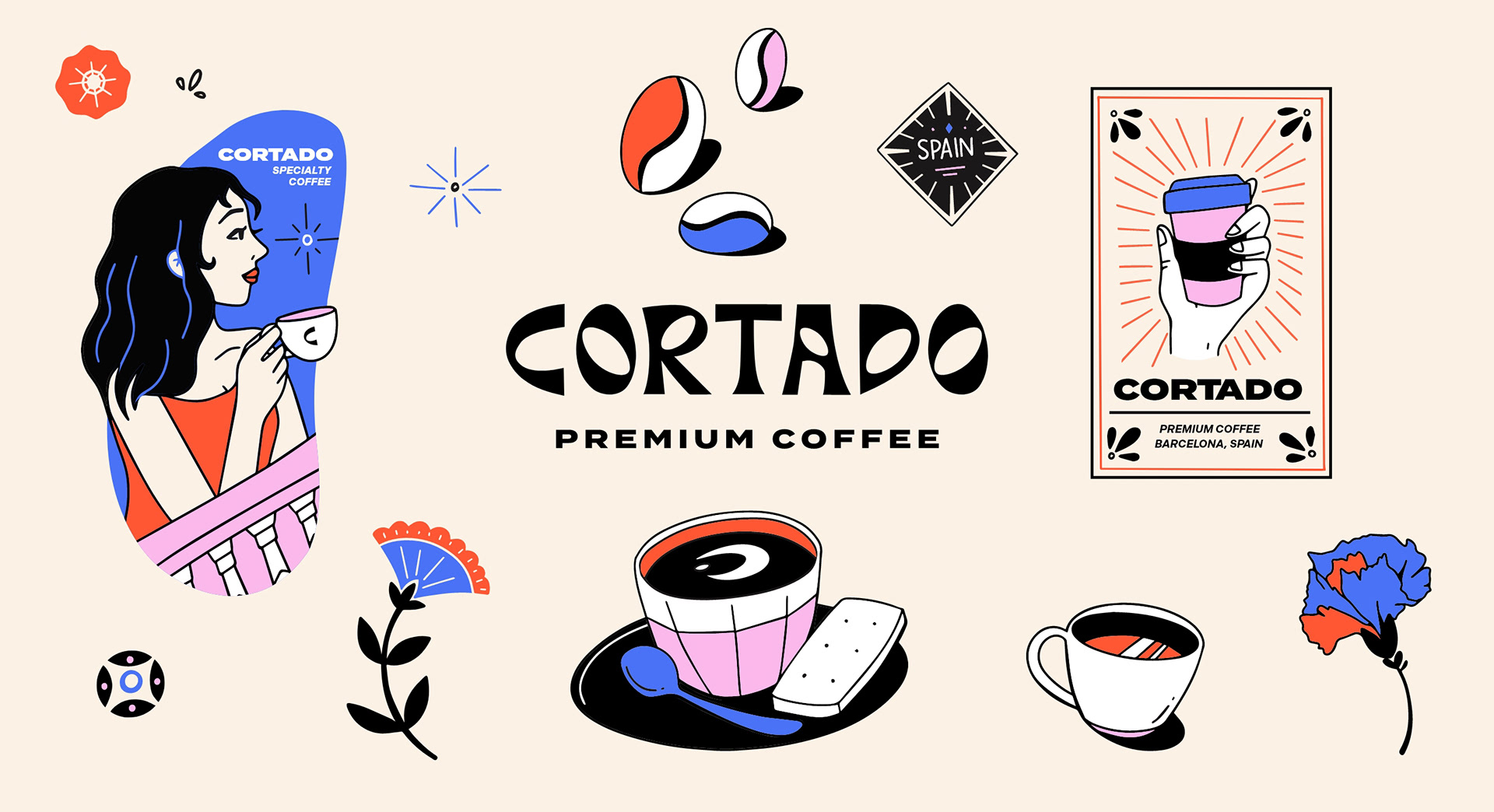
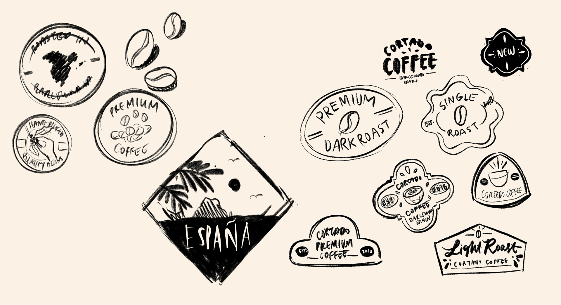
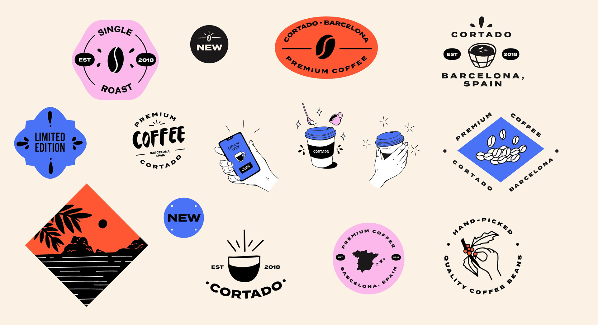
Brand illustrations and badges above were drawn by hand then later vectorized in Adobe Illustrator.
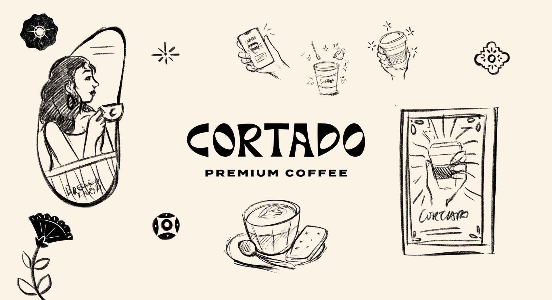
These hand-drawn elements bring a fun and personal touch to the Cortado look and feel. Certain shapes like the oval shape that surrounds the woman drinking Cortado coffee, are drawn from the windows of Casa Batlló, while other drawings are inspired by traditional Spanish tiles and shapes.
These hand-drawn elements bring a fun and personal touch to the Cortado look and feel. Certain shapes like the oval shape that surrounds the woman drinking Cortado coffee, are drawn from the windows of Casa Batlló, while other drawings are inspired by traditional Spanish tiles and shapes.
The Logo
Cortado Logo
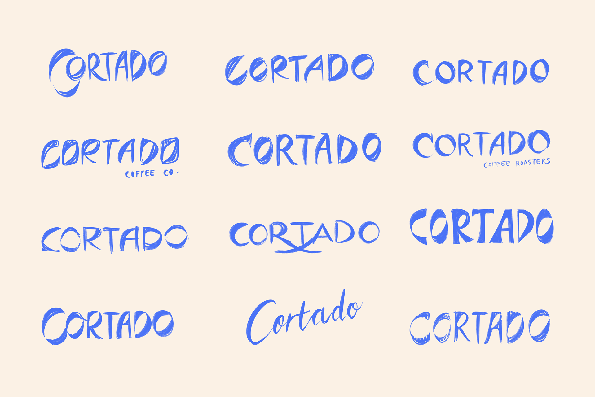
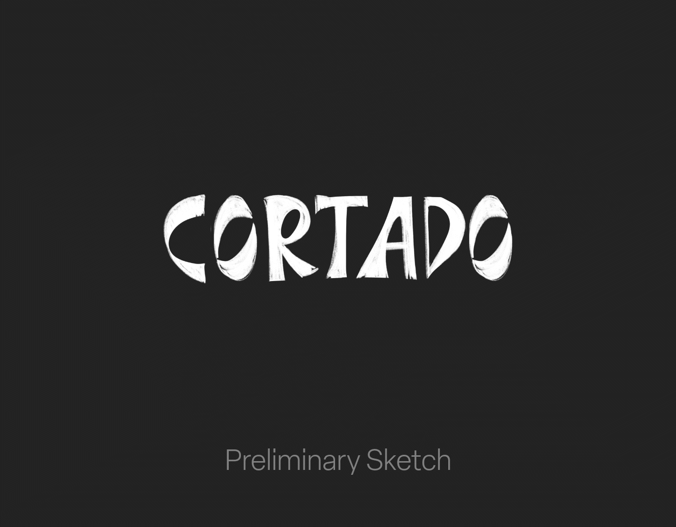
The logo was first sketched out on Procreate and then later finessed in Adobe Illustrator. Other preliminary sketches for the logo are below.
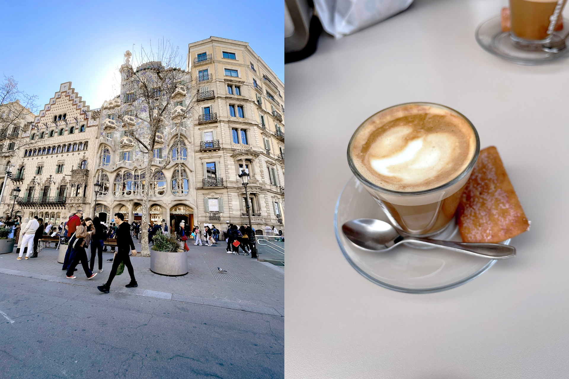
The inspiration behind this project is my trip to Barcelona with my mom. One of the most memorable places we visited was Casa Batlló, which was a building restored by the renowned architect Antonio Gaudi. During the trip, I admired countless breathtaking buildings while enjoying lots of delicious coffee in the form of something called "Cortado," a drink that has equal amounts of espresso and steamed milk. It quickly became one of my favorite drinks there, and it inspired me to create this branding project.
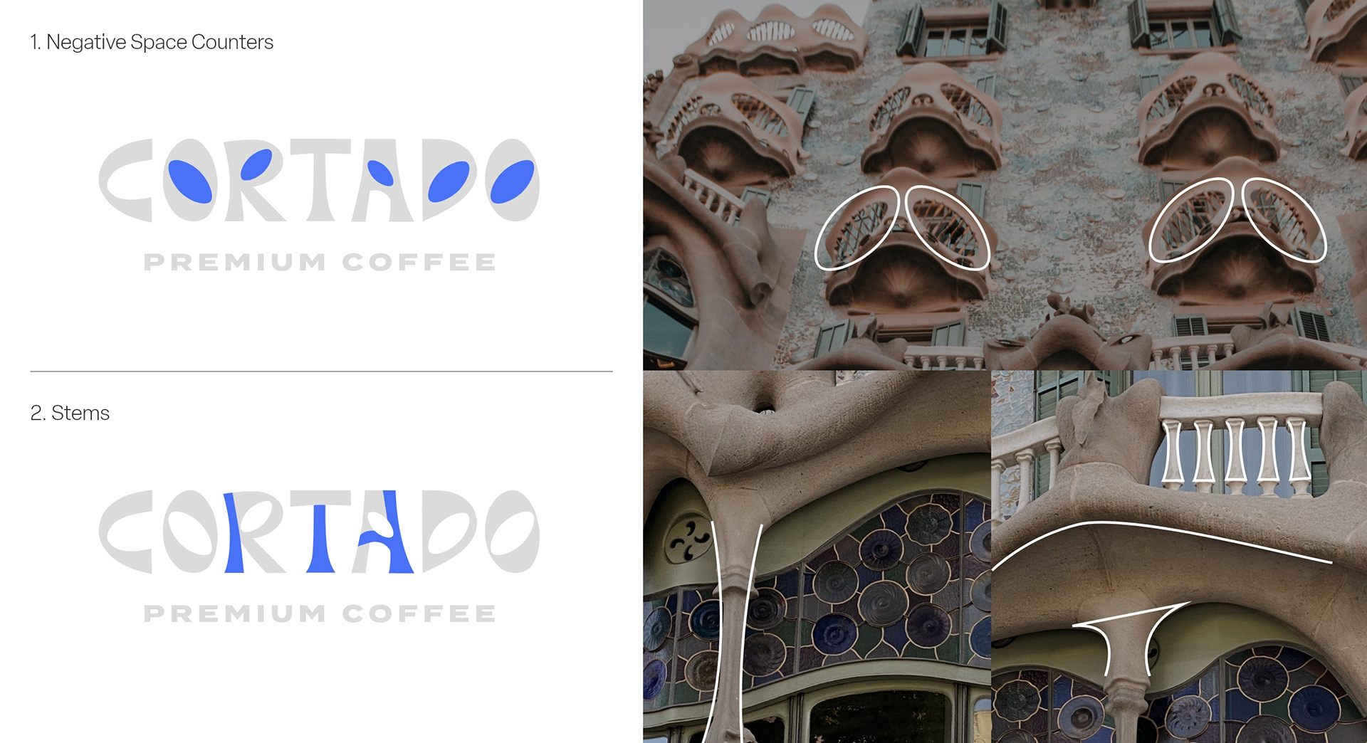
There are several elements in the logotype that correlate to the architecture in Casa Batlló
1. Counters
The negative space within the letters O, R, A and D are a reference to the oval-shaped balcony windows.
The negative space within the letters O, R, A and D are a reference to the oval-shaped balcony windows.
2. Stems
The stems of the letters R, T and A (along with the crossbar of the A) are inspired by the organic shapes of the pillars.
The stems of the letters R, T and A (along with the crossbar of the A) are inspired by the organic shapes of the pillars.
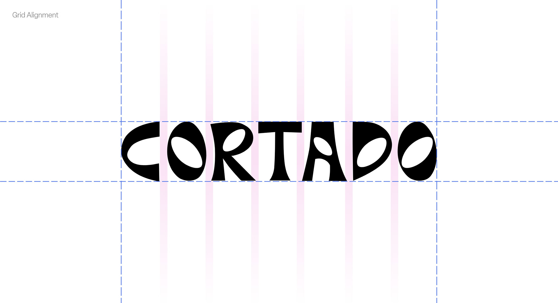
The logotype fits into a structured grid, yet takes a bit of liberties with the spacing due how shape-driven the letters are.
Colors
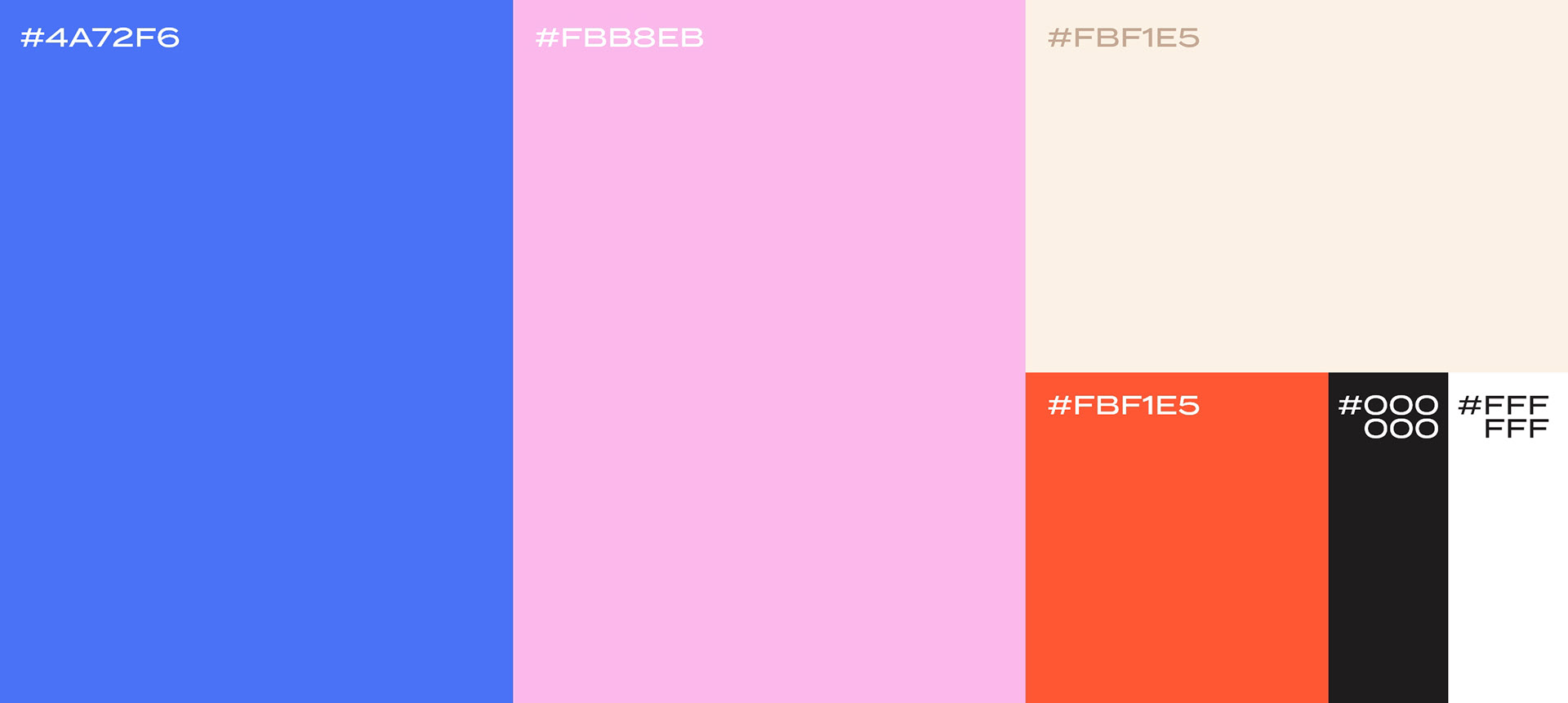
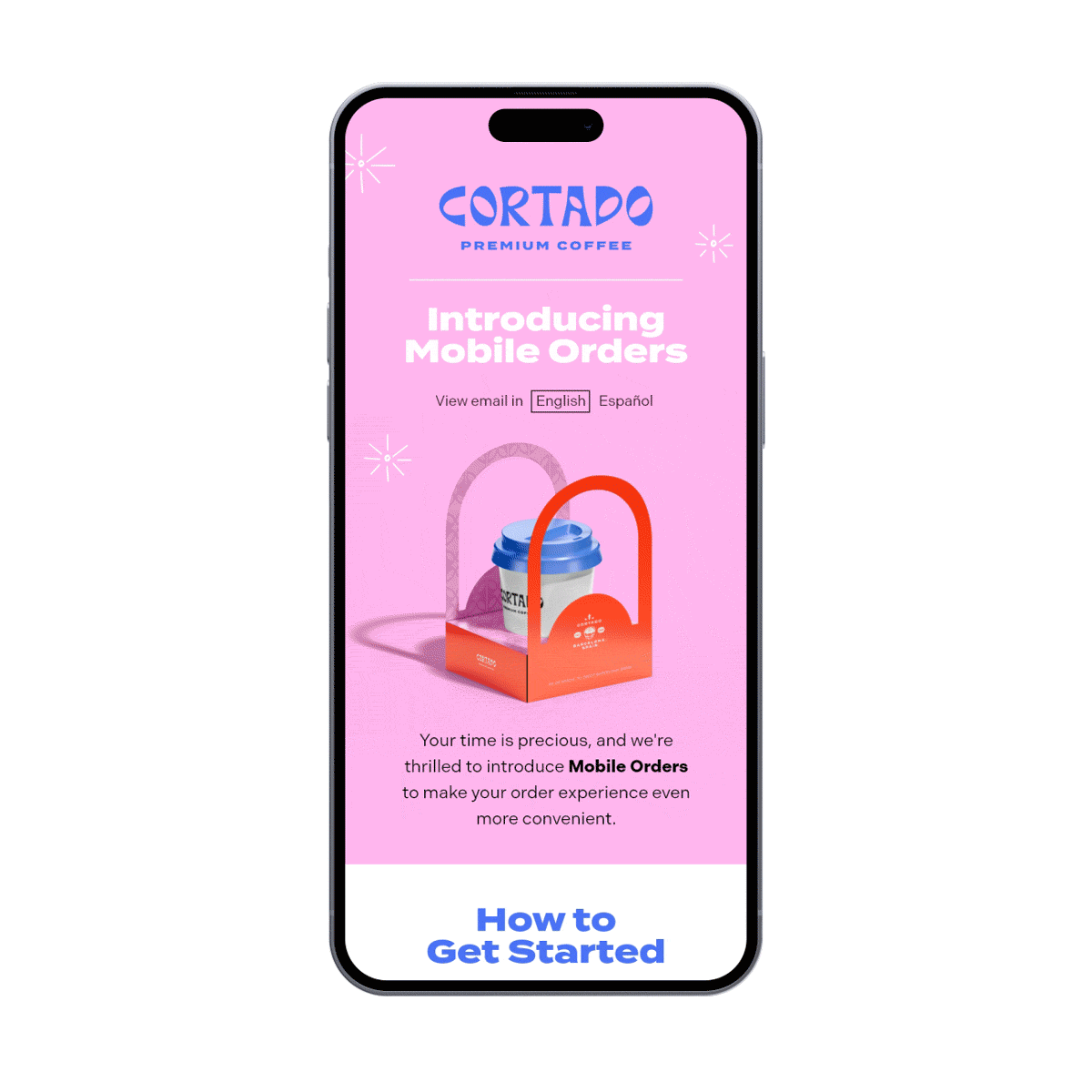
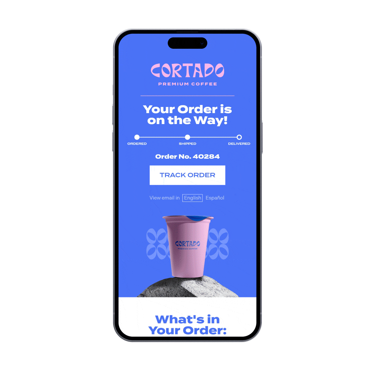
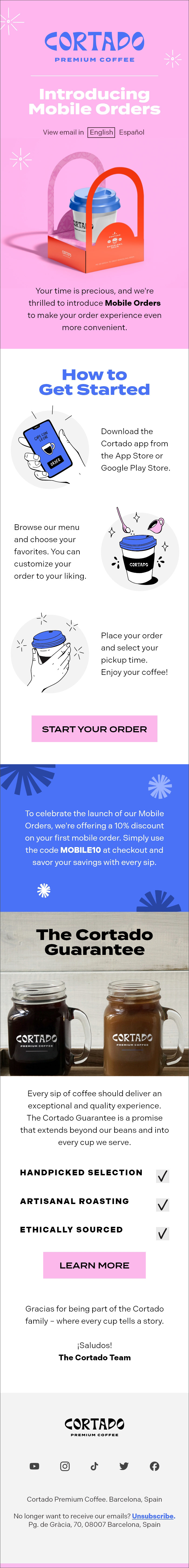
These colors are applied to the brand illustrations (above) and also Cortado's email communications (below).
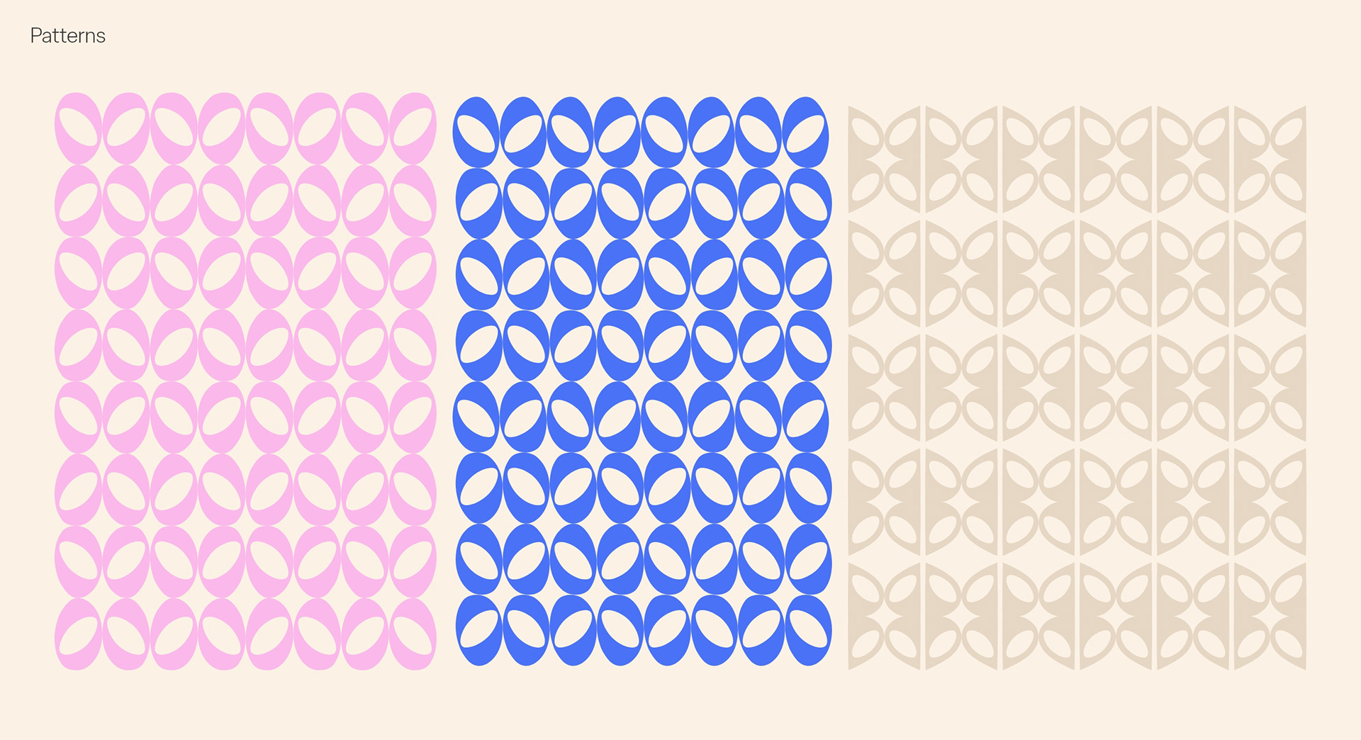
Some patterns that were developed through a repeated grid of the letters "O" and "D" from the logotype.
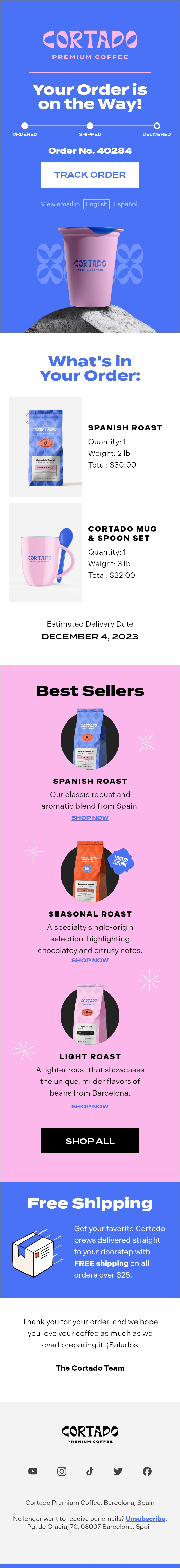
Email DESIGNS
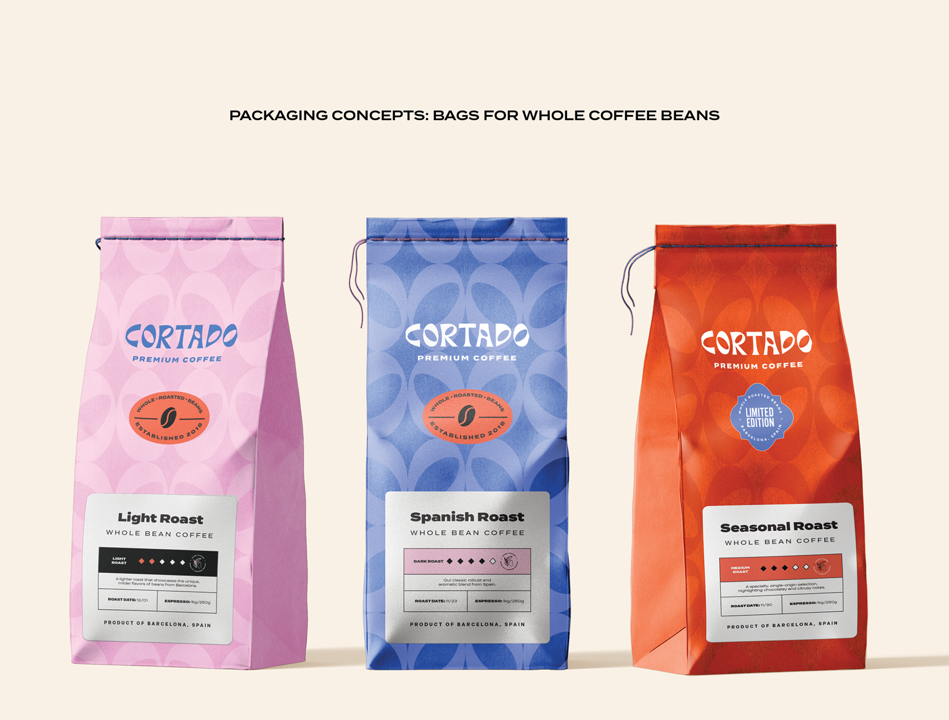
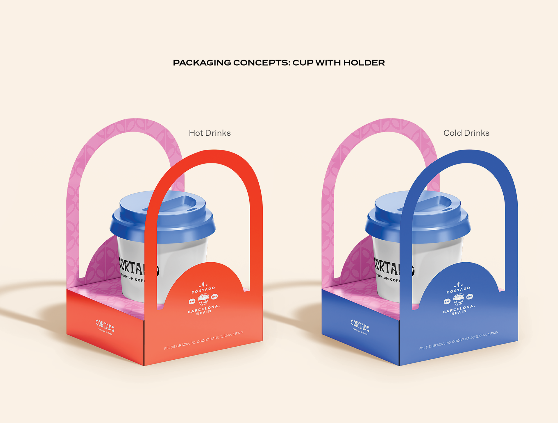
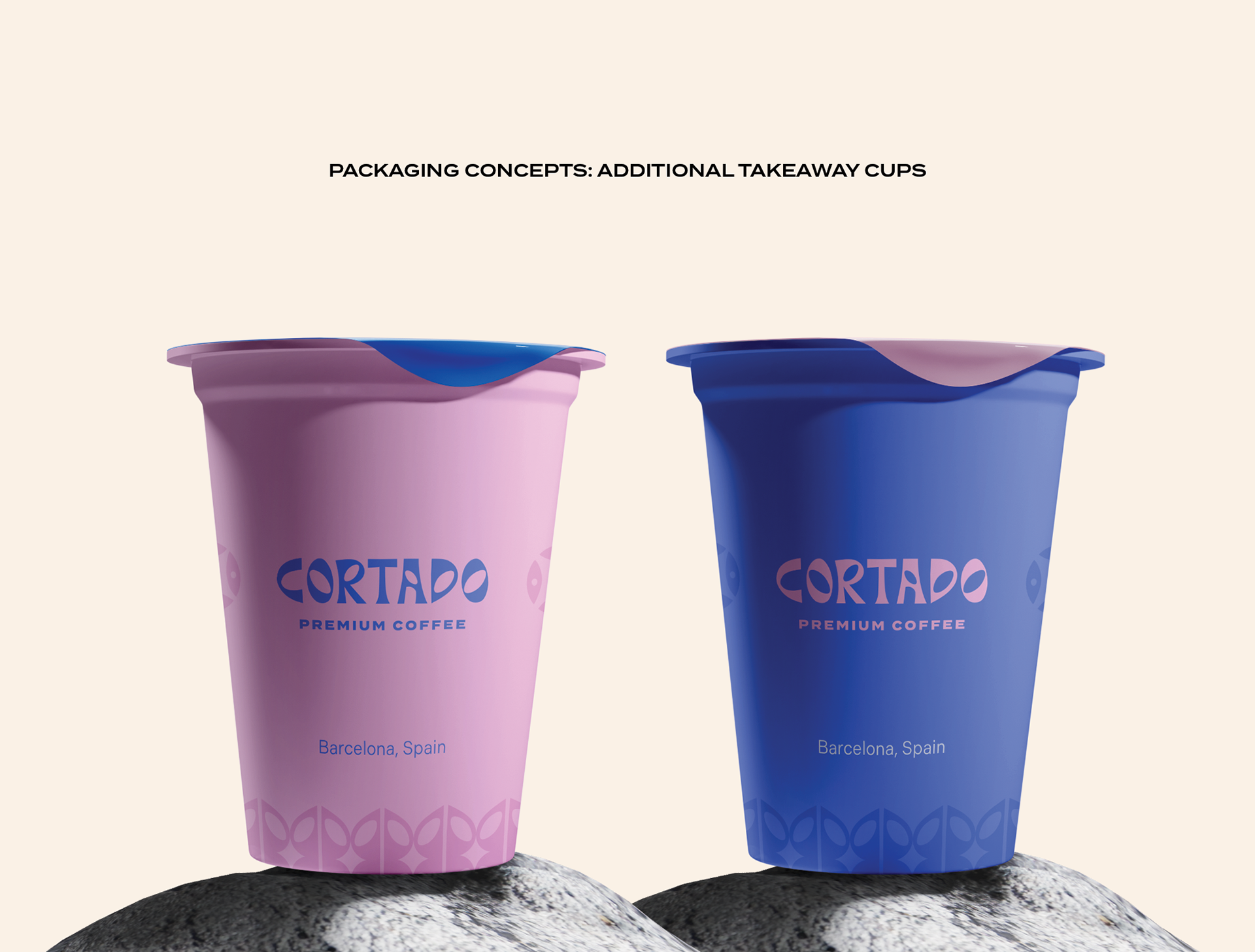
Packaging mockups
Sketches