Voyage is a site that I designed to explore an effective and aesthetic way to display suggested countries to visit.
Animated ScreenS
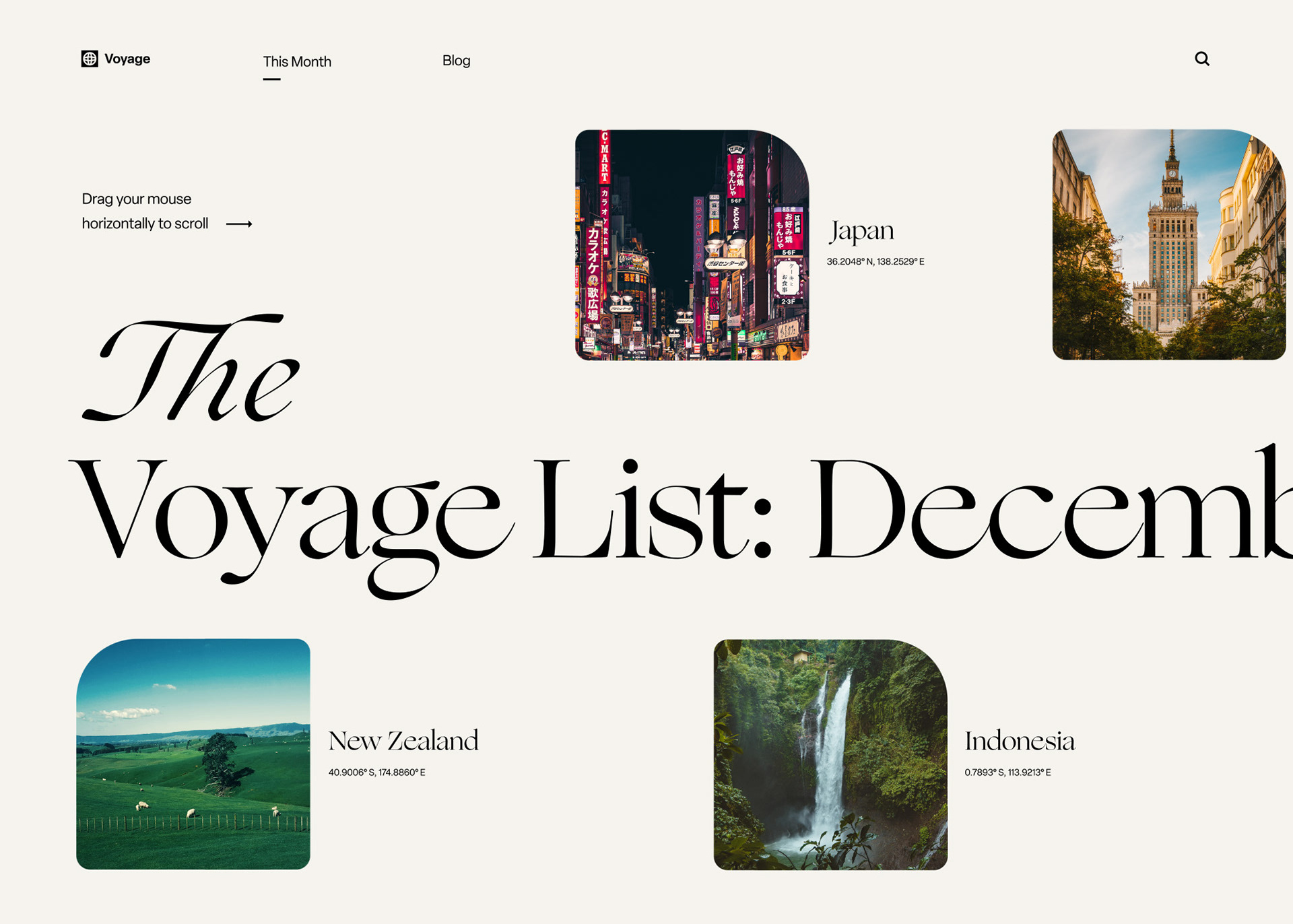
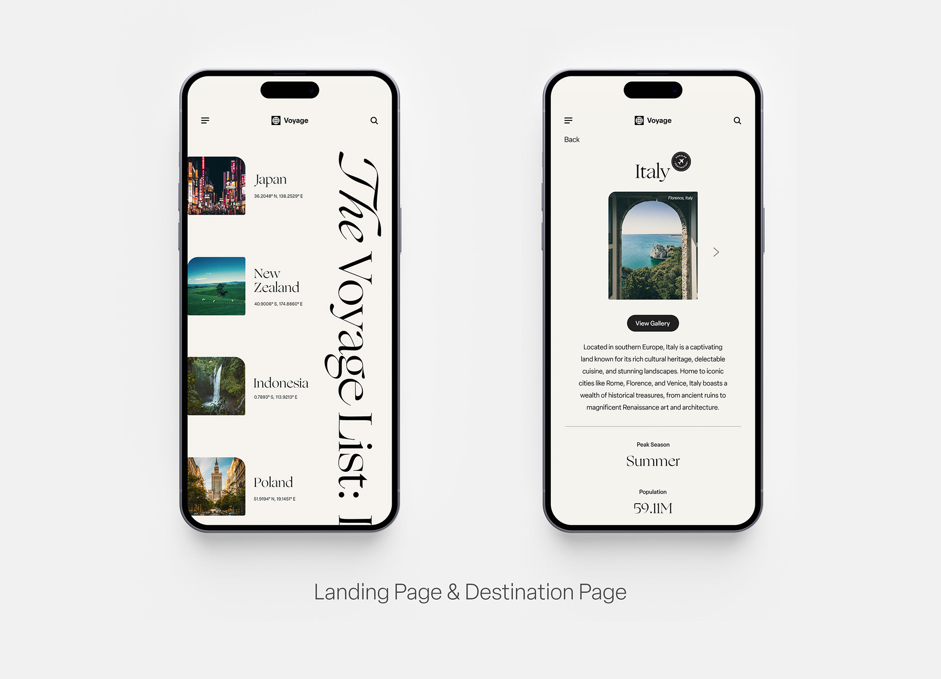
Main Landing Page
This is the first experience that a user has with the site. It features an interactive, horizontal scroll to view that month's list of featured countries that Voyage recommends as travel destinations. Upon hovering on a country's thumbnail, the frame is interactive and subtly zooms in on the image and has a small corner radius animation.
Destination Pages: Gallery Interactions
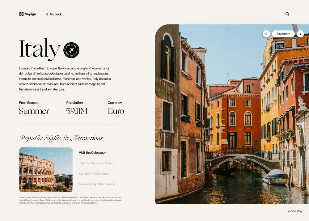
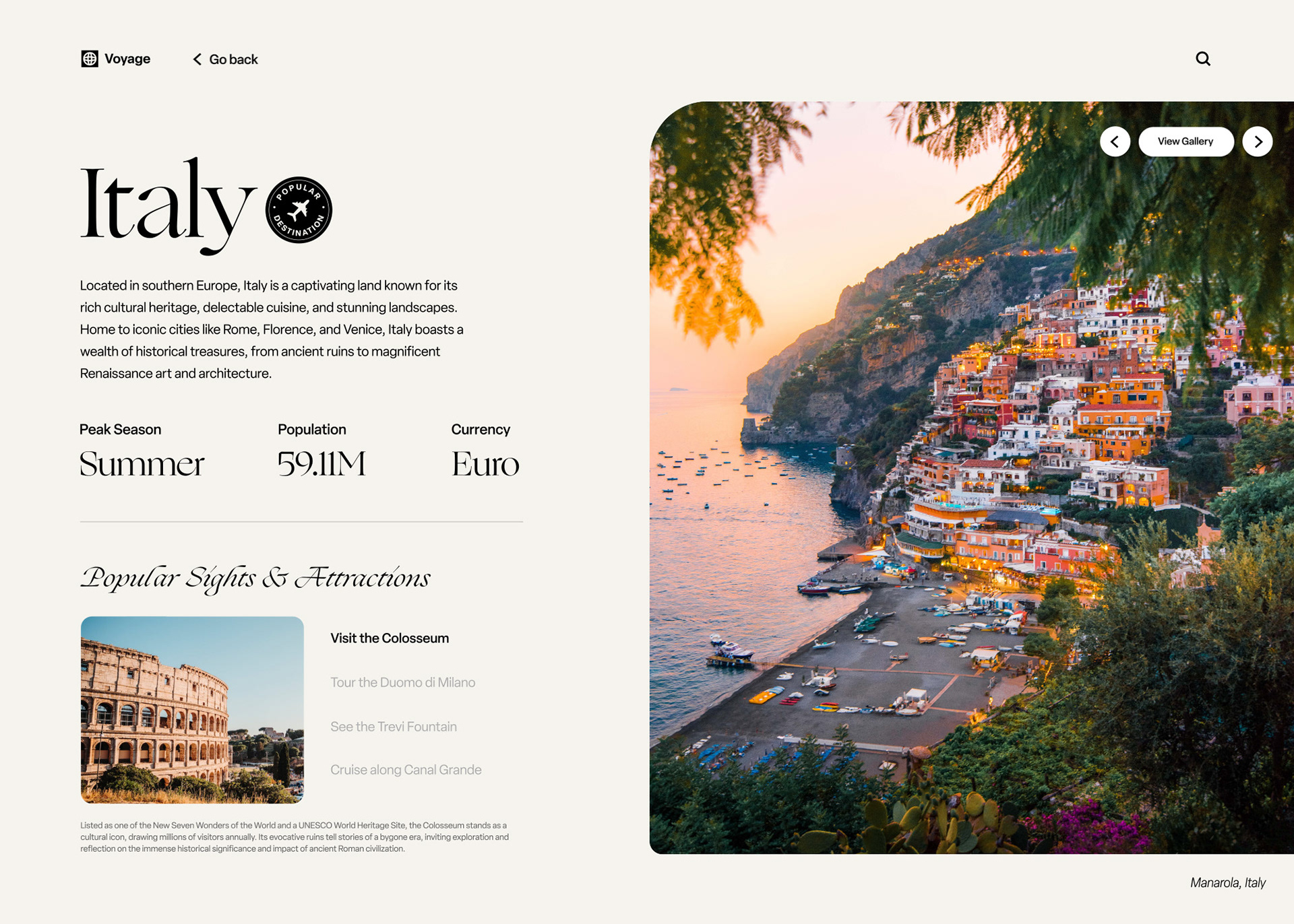
Upon selecting a destination from the initial landing page, the user is then taken to the specific page dedicated to that location. The page features interactions with a main photo gallery (with an option to view all gallery photos), a brief overview of the country and facts about the country's peak tourism season, population, and its currency.
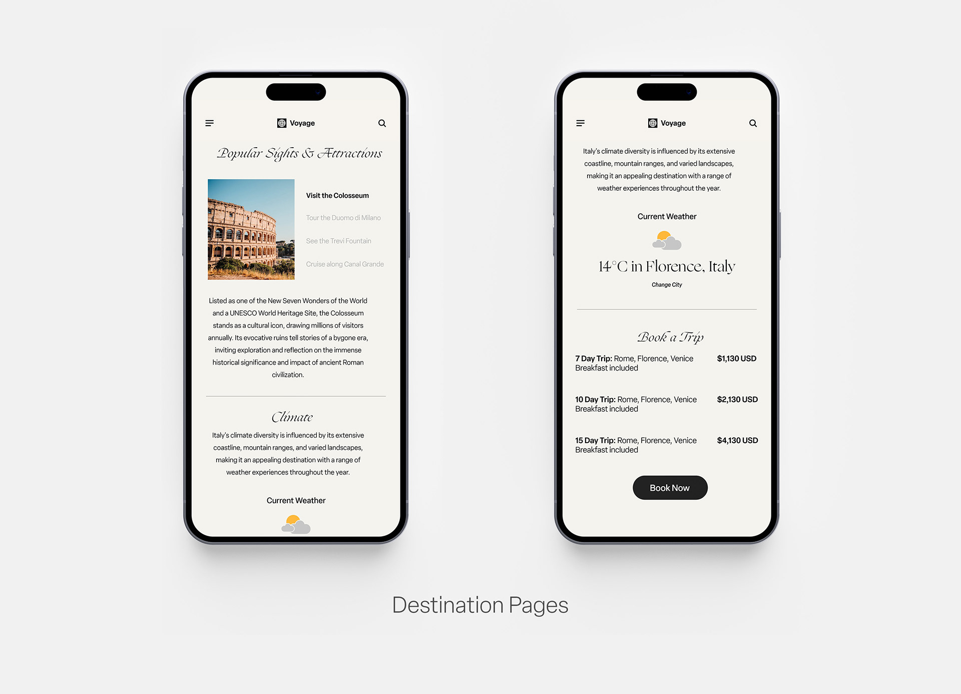
Destination Pages: Sights and Attractions, Book a Trip sections
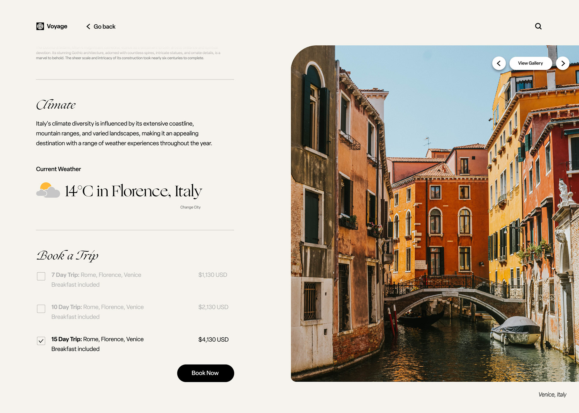
Further down in the destination page, there is a section dedicated to seeing popular sights and attractions in that specific country. Users can click on one of four selected locations or attractions, and a relevant thumbnail of that location will display. Further down the page, the country's climate is displayed, and there is an option to change the city to see a different temperature. The final section of this page holds a "Book a Trip" call-to-action segment. When the user selects a trip, the "Book Now" button is available to continue the booking.
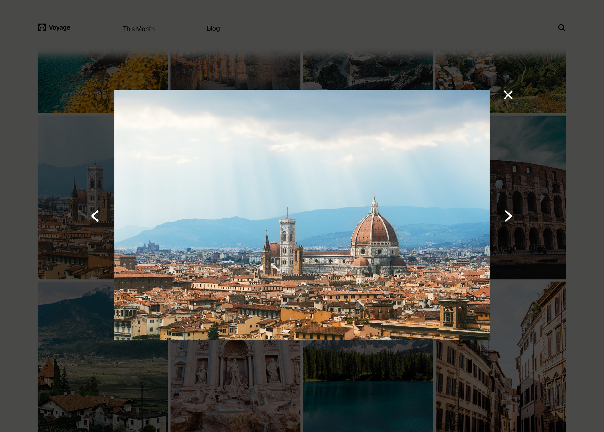
Gallery
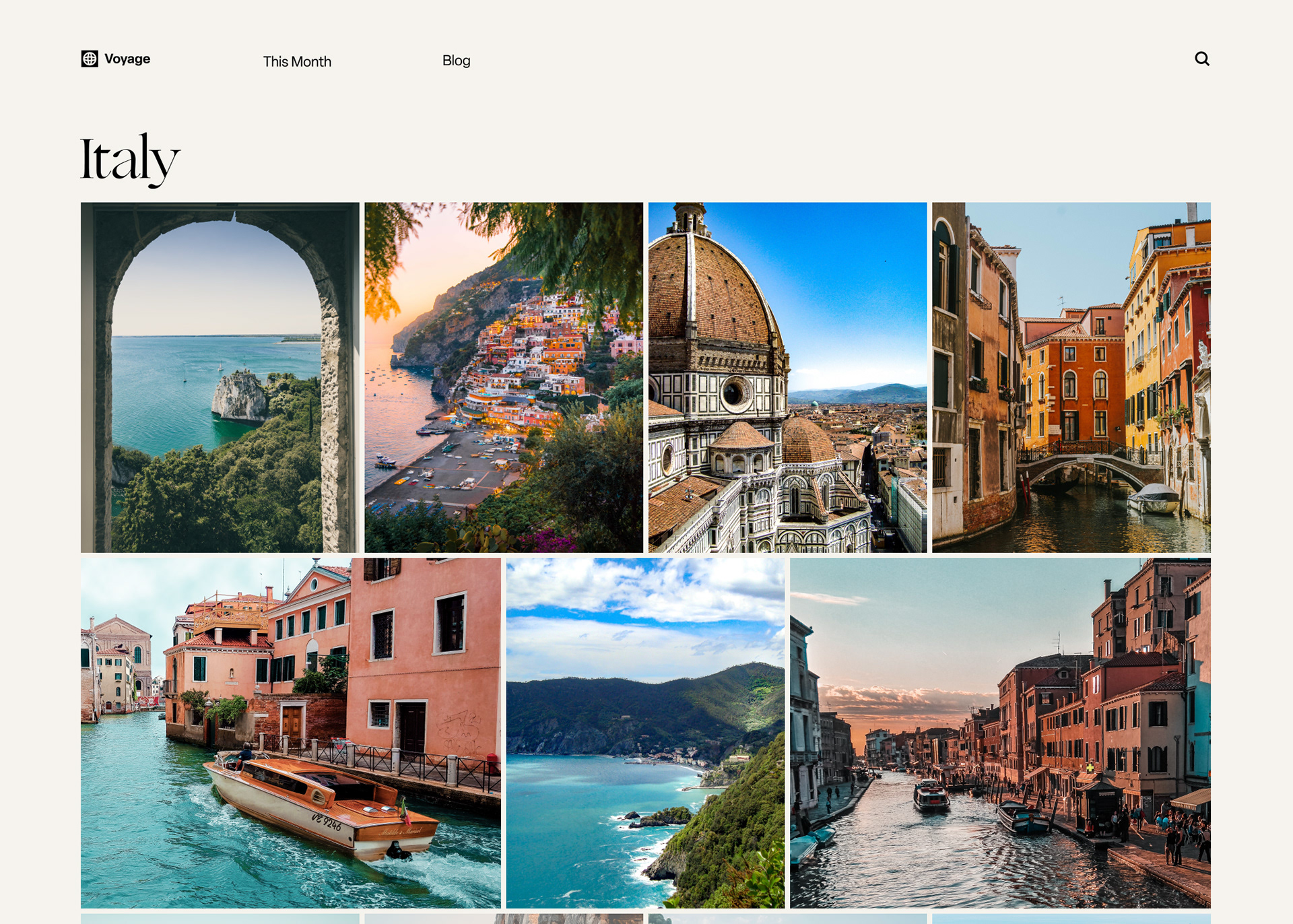
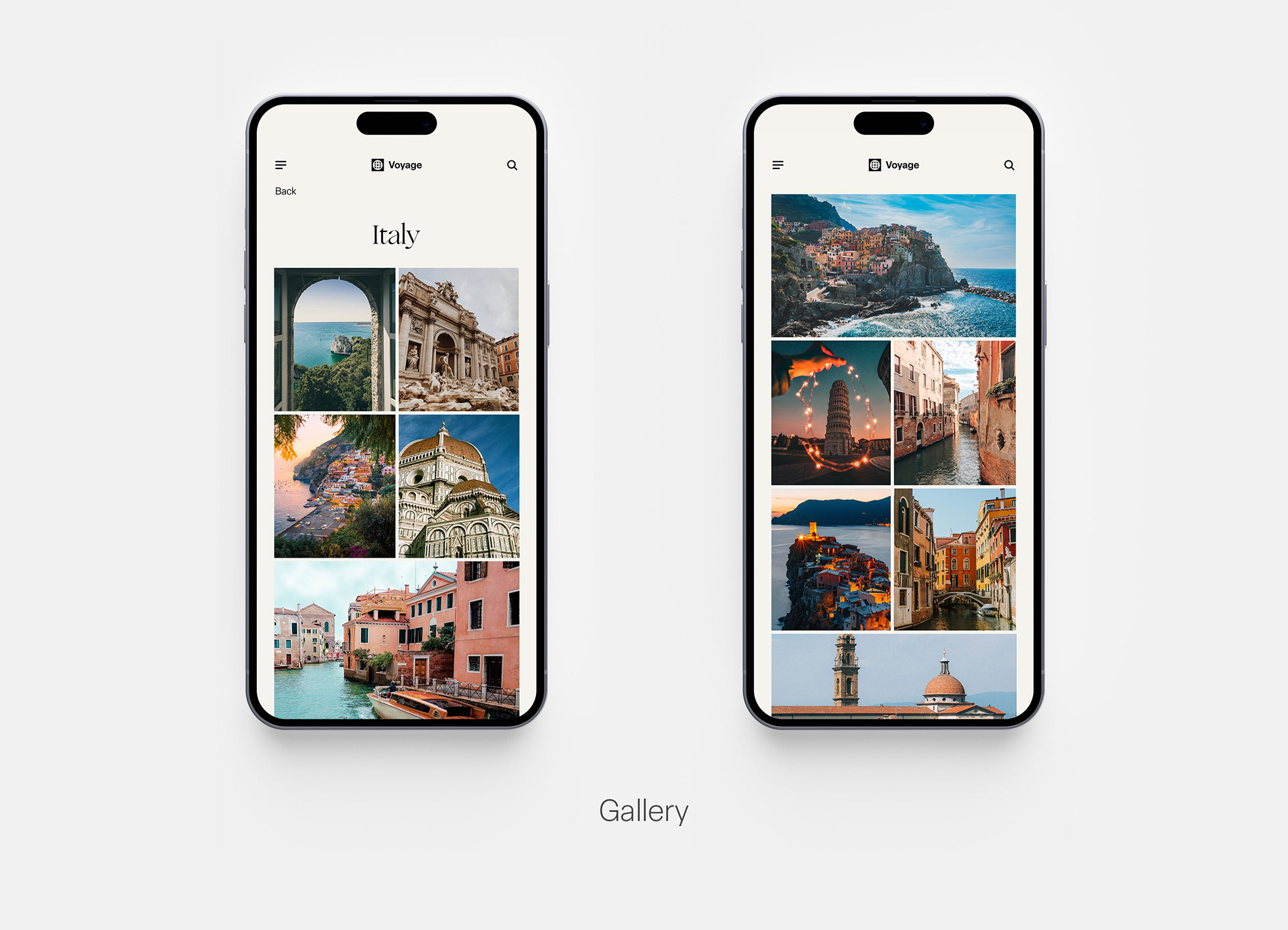
When a user clicks into the "View Gallery" call-to-action button on the top right of the main image, they are taken to this gallery. Hovering over an image makes the image zoom in and also change corner radius (similar to the homepage to create a consistent look throughout the site). Clicking into an image pulls up a lightbox to view the image at a bigger size.
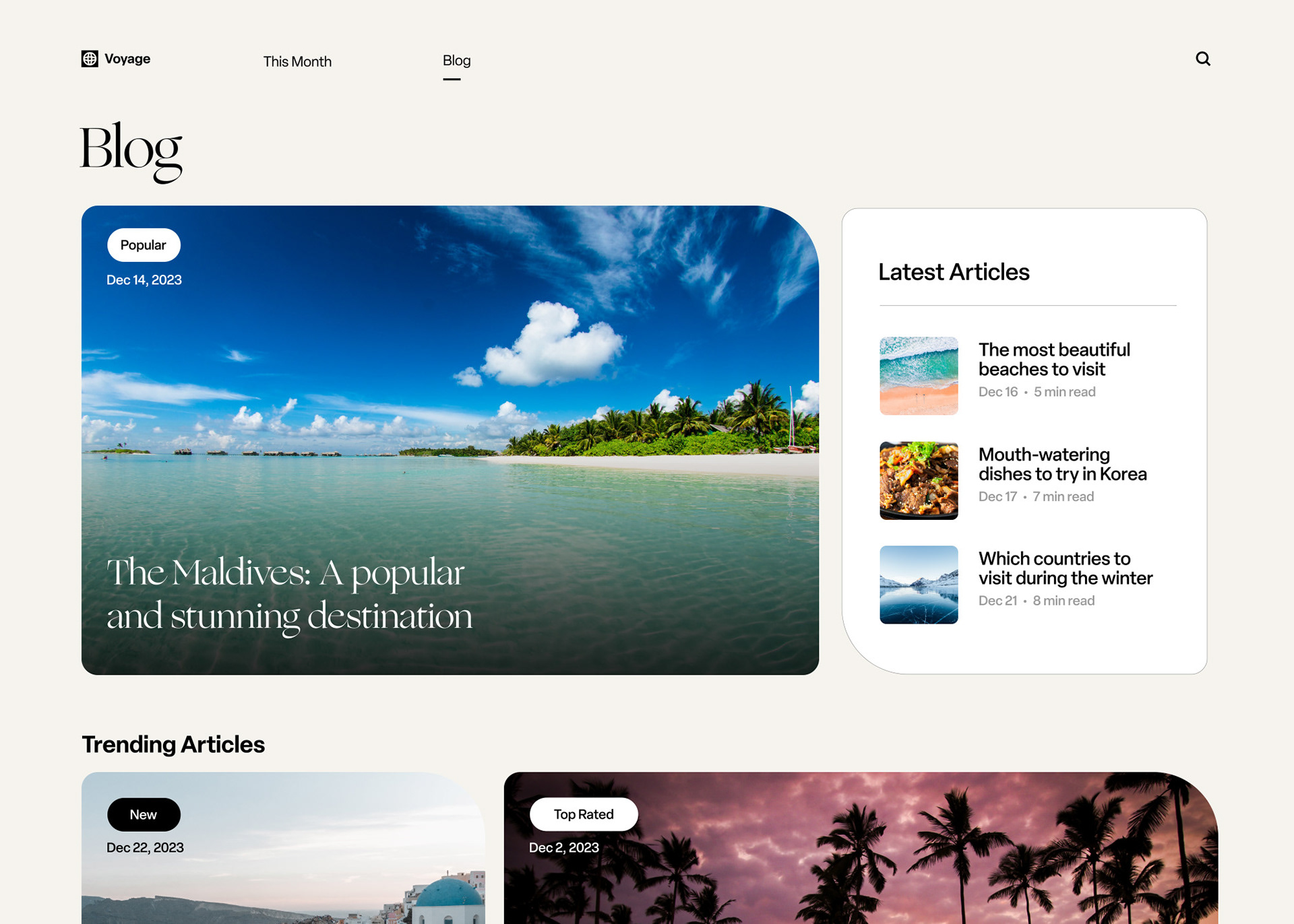
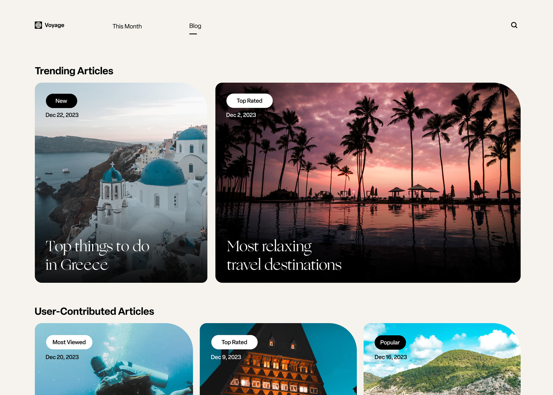
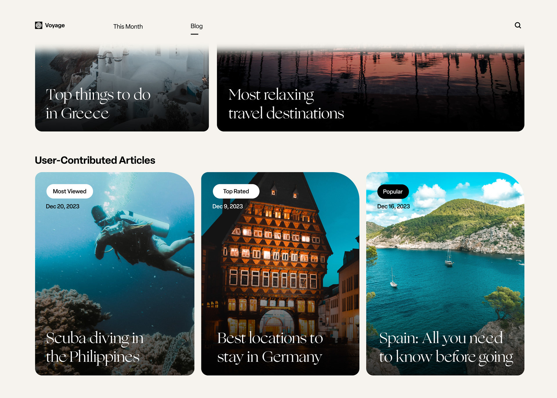
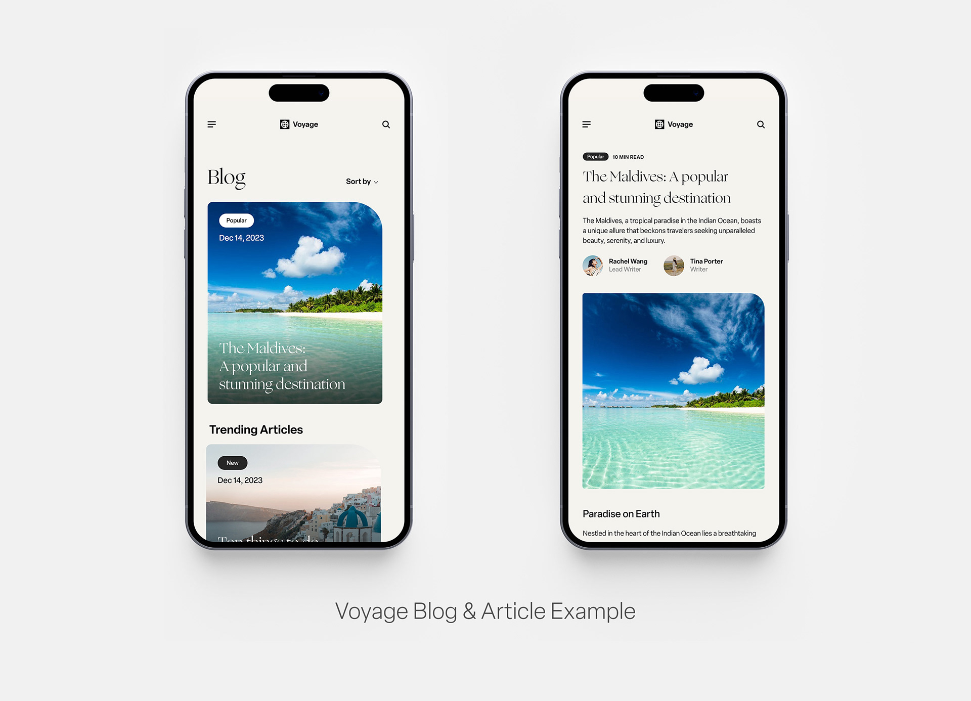
Blog
Another feature of this landing page is the Blog, which contains interesting articles written by site users or writers at Voyage. The blog thumbnails load in smoothly upon entering the section, and organized by various sections (i.e. Latest, Trending, and User-Contributed articles.
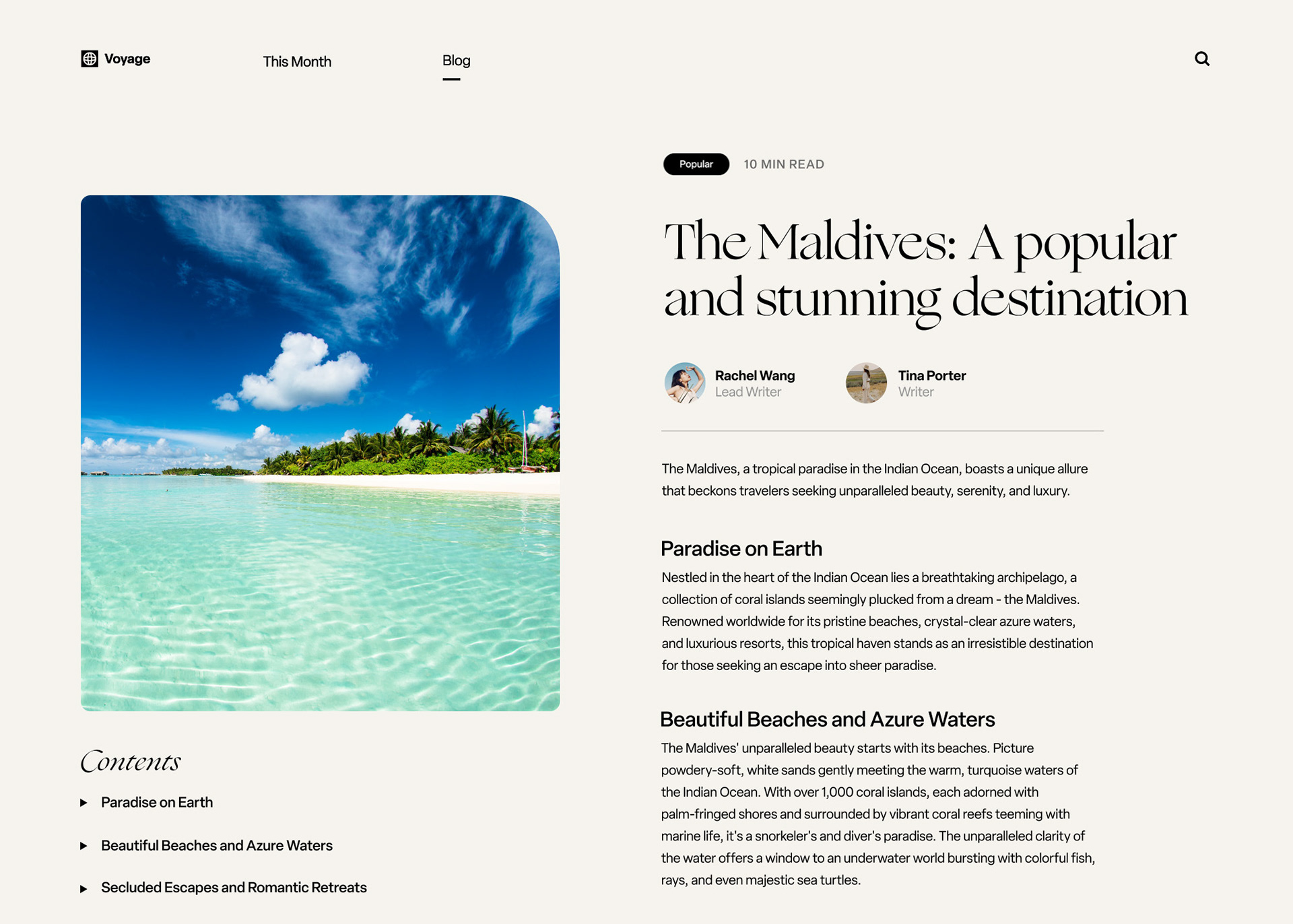
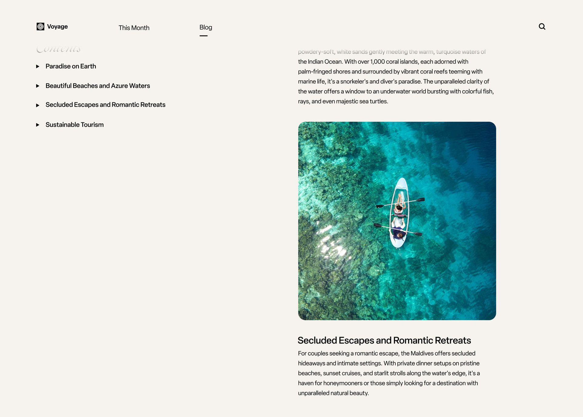
Blog Post
This screen displays an example of a blog post, which has a main image that was used in the thumbnail of the blog homepage. The blog page shows the writers' names, the article's contents broken up in an index on the left hand column, and the copy itself. The copy is organized by headers and separated by relevant imagery that loads as the user scrolls to read more.
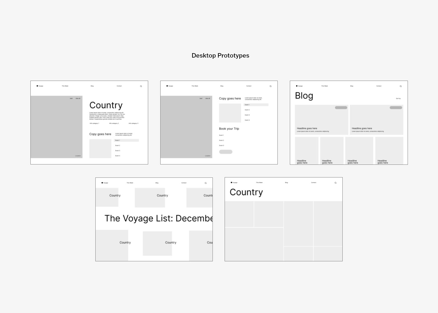
Static Desktop Screens
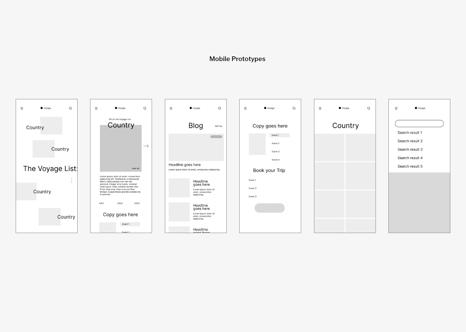
Mobile SCREENS
Prototypes
Prototypes that were created in Figma to guide the final design.